Weekly S&P 500 #ChartStorm - 18 Dec 2016
Those that follow my personal account on Twitter <a href="https://twitter.com/Callum_Thomas" target="_blank" data-event-type="click" data-event="link_click">(VIEW LINK)</a> will be familiar with my weekly S&P 500 #ChartStorm in which I pick out 10 charts on the S&P 500 to tweet. Typically I'll pick a couple of themes and hammer them home with the charts, but sometimes it's just a selection of charts that will add to your perspective and help inform your own view - whether its bearish, bullish, or something else!
This week we look at a selection of charts that will give plenty of fodder to both bulls and bears; touching on valuation, earnings outlook, sentiment, economic noise, sector shifts, seasonality, analogs, and breadth. Enjoy!
The purpose of this note is to add some extra context beyond the 140 characters of Twitter. It's worth noting that the aim of the #ChartStorm isn't necessarily to arrive at a certain view but to highlight charts and themes worth paying attention to.
So here's the another S&P 500 #ChartStorm write-up [note: this week features a whole lot of graphs from Topdown Charts, partly as a celebration of hitting the 3-month mark, and partly due to a minor dearth of charts].
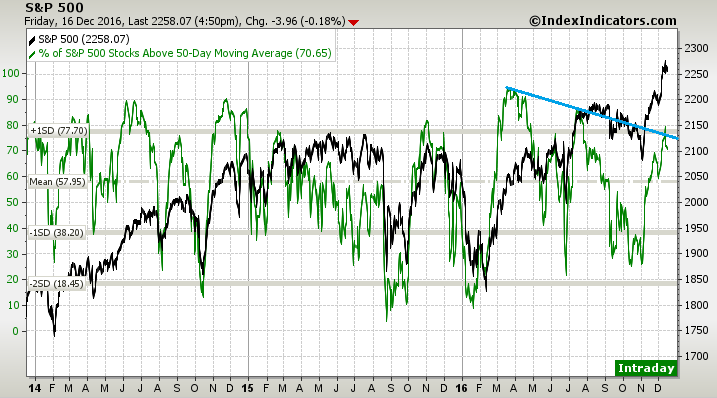
1. 50-day moving average breadth: First up is an update of the 50dma breadth chart - as some might recall from last week this was also chart number 1 as the downward sloping trend line looks to be a key test for the market. At this point the breadth indicator has breached the line and pulled back - so there is a risk that the test has been failed. That would mean a short-term selloff or correction. But with positive seasonality still in force it may be too soon to call it on this one.
Bottom line: At this point it's looking like the market has failed the breadth test...
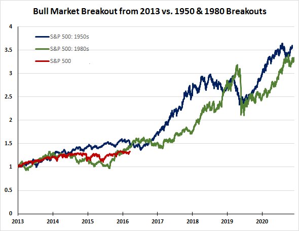
2. Market analogs - breakout decades: This interesting chart from HORAN Capital Advisors (VIEW LINK) the experience during the 1950's and the 1980's after the market made a breakout. In both cases a significant bull market followed, and if these periods are anything to go by it could be an interesting next couple of years for the S&P500. (p.s. the usual caveats about analogs apply!)
Bottom line: If the bull market breakouts of the 50's and 80's are anything to go by the next few years could get interesting.
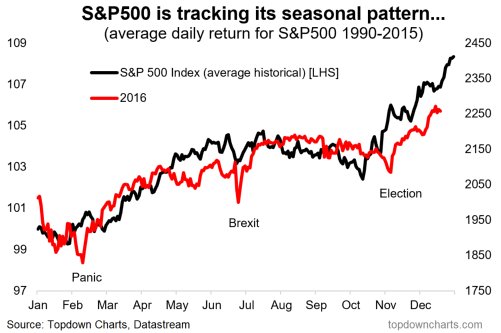
3. S&P500 seasonality: One of my favorite charts of the year, the market in 2016 has tracked its historical seasonal pattern remarkably well, with the exception of the panic at the start of the year, the Brexit, and the Election. Albeit since the election it has lagged its seasonal pattern slightly, but still is moving more or less in line. What that means short-term is the last 2 weeks of the year could see the S&P500 drive on to close above 2300 with relative ease as the "Santa Claus rally" kicks in.
Bottom line: Seasonality is still positive for the market.
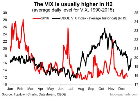
4. VIX seasonality: On the topic of seasonality, the average level of the VIX also appears to be subject to seasonality; typically being higher in the second half of the year and lower in the first half of the year. As for the outlook, it's currently at the low point, and there seems to be a curious little seasonal spike that happens into year-end. I suppose this makes sense as liquidity will be tight and people may opt to put hedges on as the festivities take priority!
Bottom line: VIX seasonality shows a slight spike into year end.
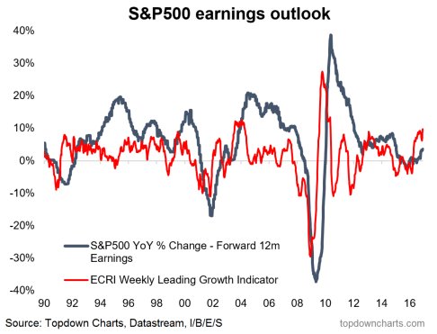
5. Earnings outlook: This chart saw a lot of doubters when I first showed it (which was before that black line had really started to turn up). But anyway what it shows is the ECRI weekly leading economic growth indicator against the 12 month change in forward earnings. Long story short, whenever the economic indicator turns up - particularly after an earnings recession, it often flags an improvement in earnings growth. We've seen this confirmed elsewhere e.g. with the manufacturing PMIs making a clear turnaround. So on this indicator alone we should expect a more favorable earnings story over the coming months.
Bottom line: The earnings outlook is improving.
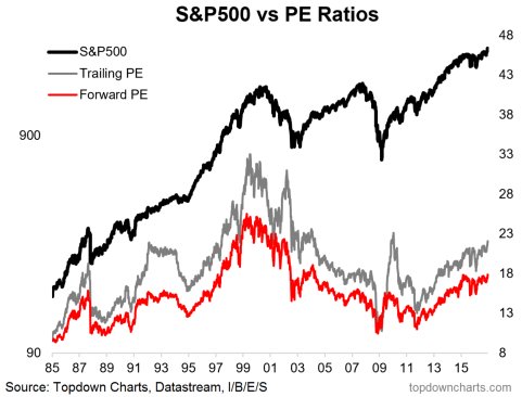
6. Valuations: PE ratios based on trailing 12 months earnings, and forward 12 months earnings are both tracking towards the top end of the range of the past couple of decades. So one interpretation is that this is still reflecting the earnings recession and thus is a distorted signal, or that investors are simply paying up for a better earnings outlook. Of course, the other interpretation is that the market is overvalued and the odds of a big correction are rising.
Bottom line: Valuations are getting higher.
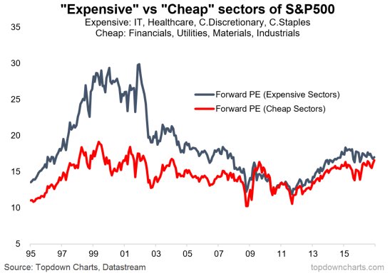
7. Cheap sectors and expensive sectors: This chart shows the average forward PE for "cheap" sectors (i.e. sectors that have typically traded at lower valuations), and "expensive" sectors (sectors that have historically traded on higher valuations). There's a clear shift leading into the financial crisis - after the crisis valuations converged (QE effects? or the product of a macro-driven risk-on/risk-off environment maybe). Anyway, one interesting development is that the expensive sectors are becoming slightly cheaper, and the cheaper sectors are starting to get expensive...
Bottom line: There has been some convergence between cheap and expensive sectors.
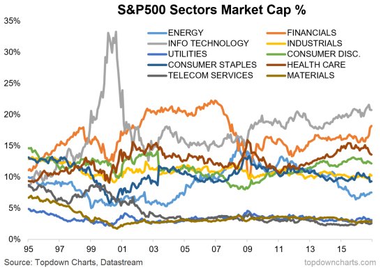
8. Sector representation: This chart shows the latest trends in sector representation by market cap percentage. The most notable development has been the surge in financials (and fall in healthcare/biotech). More broadly it's interesting to note that there hasn't really been any standout bubble sectors so far (except maybe healthcare) - but certainly none like tech in 2000, or financials pre-financial crisis, or even energy at the peak. The other thing, longer term it's interesting to note how the market has change from a more even split across sectors in 1995 to more variation now e.g. materials/telcos/utilities at the bottom end and IT/financials/healthcare at the top end.
Bottom line: Sector representation by market cap continues to see structural and cyclical change.
9. The Economic Noise Index: The economic noise index is a little thing I put together based on the Economic Policy Uncertainty Index, and the Citi Economic Surprise Index for the US. It captures the level of economic noise and the direction (i.e. a reading below zero means more negative economic surprises and more economic policy uncertainty). As you might expect the market tends to to less well when the indicator turns down, but at extremes it seems to work as a contrarian indicator (which would make sense as economic noise will influence sentiment). I briefly touched upon the Economic Noise Index in the latest edition of the Weekly Macro Themes (VIEW LINK) - which included a graph of the Economic Noise Index for emerging markets.
Bottom line: The US economic noise index is currently around neutral.

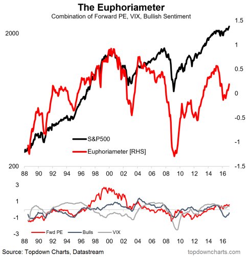
10. The Euphoriameter: Another weird and innovative indicator, the "Euphoriameter" (VIEW LINK) attempts to capture the level of euphoria (or otherwise) in the market. It looks at forward PE ratios (higher = more euphoric), the VIX (lower = more euphoric), and bullish sentiment (self explanatory!). The VIX and bullish sentiment measures are 12-month smoothed to give a clearer signal and capture the key trends over the longer term. The main point is that it's starting to surge after a dive down last year, but is not quite at levels of euphoria that would be considered irrational exuberance as such.
Bottom line: The Euphoriameter is starting to surge.
So where does all this leave us?
This week there's probably 2 categories of interest:
1. Bullish
The arguably bullish ones are the 50's and 80's analog (longer term), the positive seasonality (short-term), the improving earnings outlook, and arguably rising euphoria - if justified - is a good thing in that it creates a self-reinforcing feedback loop for stocks to go higher (at least until it hits extremes).
2. Bearish
On the bearish side of things, there's that point about the market seeming to fail its breadth test (by hitting the down sloping trendline and then pulling back slightly). There's that odd seasonal VIX spike into year end. And there's rising valuations, with the cheap sectors becoming more expensive.
Summary
Overall, it's the usual case of some bullish charts, some bearish charts, and some general background information/context, or just plain interesting charts. As for views and conclusions, I would say short-term you can't ignore seasonality, but the risk of a short-term correction is rising. Of course the reason I say risk of only a short-term correction is that the improving earnings outlook is supportive for the medium term outlook. Anyway, enjoy the Santa Claus Rally (assuming it comes!), and FYI - the writeup takes a break next week, returning the week after. Happy holidays!
See also: Weekly S&P500 #ChartStorm - 11 Dec 2016 (VIEW LINK)
Never miss an update
Enjoy this wire? Hit the ‘like’ button to let us know.
Stay up to date with my current content by
following me below and you’ll be notified every time I post a wire
Callum is Head of Research at Topdown Charts.
Topdown Charts is a chart-driven macro research house covering global Asset Allocation and Economics.

8 topics

Callum is Head of Research at Topdown Charts. Topdown Charts is a chart-driven macro research house covering global Asset Allocation and Economics.
Expertise
Callum is Head of Research at Topdown Charts. Topdown Charts is a chart-driven macro research house covering global Asset Allocation and Economics.
Expertise
Comments
Comments
Sign In or Join Free to comment